In today’s fast-evolving creative landscape, blending disciplines is no longer a luxury but a necessity. Whether you’re a graphic designer, illustrator, or digital artist, understanding music theory can unlock unexpected pathways to innovation.
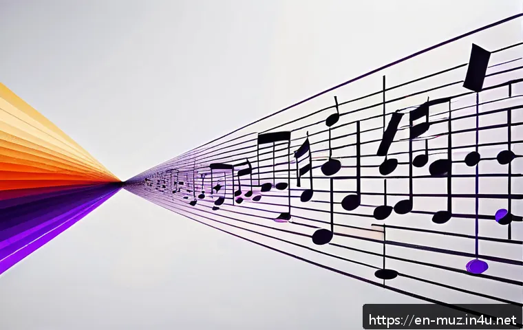
Recent trends highlight how the rhythms, patterns, and structures of music inspire fresh visual concepts and dynamic designs. If you’ve ever felt stuck in your creative process, exploring this synergy might be the breakthrough you need.
Let’s dive into how music theory fuels originality and transforms careers in the visual arts world.
Harmonizing Visual Rhythm: Crafting Movement and Flow
Translating Musical Tempo into Visual Pace
When I first started experimenting with music theory in my design work, one thing stood out: tempo isn’t just about speed; it’s about how the eye moves across a canvas.
Imagine a fast-paced allegro in music — it’s energetic, lively, and demands attention. Visually, that translates into quick transitions between elements, sharp contrasts, and dynamic layouts.
Conversely, a slow adagio encourages a more measured, lingering gaze, which can be achieved with smooth gradients, soft edges, and ample negative space.
Understanding tempo helped me intentionally guide viewers through a composition, much like a conductor directs an orchestra.
Patterns and Repetition: Building Visual Hooks
Repetition in music creates familiarity and anticipation; think of a catchy chorus that sticks in your head. In graphic design, repetition of shapes, colors, or motifs can evoke similar effects.
Using recurring elements provides cohesion and rhythm, making a piece feel unified and memorable. I’ve noticed that when I apply rhythmic patterns inspired by musical beats, the design not only looks balanced but also feels alive.
It’s like the work is pulsing with an internal beat, inviting viewers to engage more deeply.
Visual Crescendo: Designing with Dynamic Builds
In music, a crescendo builds intensity, leading to an emotional climax. Translating this into visual art involves gradually increasing complexity, color vibrancy, or element size to create tension and release.
For example, a poster might start with minimal text and simple shapes at the bottom, progressively layering more details toward the top. This technique keeps the viewer hooked, mirroring the emotional journey music takes listeners on.
I’ve personally found that this approach transforms flat designs into immersive experiences that resonate longer.
Color Theory Meets Tonal Harmony: The Science Behind Mood
Mapping Musical Keys to Color Palettes
There’s a fascinating relationship between musical keys and color moods. Major keys often feel bright and uplifting, which pairs naturally with warm, vivid colors like yellows and oranges.
Minor keys evoke melancholy or introspection, matching cool blues and purples. When I created branding materials, choosing a color scheme based on a key signature I wanted to convey helped anchor the emotional tone.
It’s like painting with sound — each hue carries a note that influences the overall feeling.
Chords as Color Combinations
Just as chords blend multiple notes to create harmony, color combinations mix hues to evoke balance or tension. Triadic color schemes, for example, resemble triads in music — three distinct but complementary tones that create vibrancy without chaos.
Using this analogy made selecting color groups less random and more intuitive for me. Instead of guessing what colors “look good” together, I thought of how notes in a chord interact, which brought more confidence and coherence to my palettes.
Emotional Resonance Through Synesthetic Design
Some artists experience synesthesia — sensing colors when hearing music or vice versa. Even without this, consciously pairing music theory with color can deepen emotional impact.
When I design for campaigns that aim to inspire or soothe, aligning color temperature with musical mood helps reinforce the message. This layered approach creates a multisensory narrative that feels richer and more authentic, something clients often praise for its subtle emotional pull.
Structural Composition: From Measures to Layouts
Breaking Down Visual Grids Like Musical Measures
Musical measures organize rhythm into digestible chunks, and this concept applies beautifully to visual layouts. I began thinking of grids as “measures” that frame design elements in time and space.
This mindset helped me balance complexity and clarity, ensuring no section overwhelms or feels empty. It’s all about pacing — just like in music, where silence between notes is as important as the notes themselves.
Counterpoint in Visual Storytelling
Counterpoint in music involves two or more independent melodies interacting harmoniously. In design, this translates to balancing contrasting elements—like bold typography against delicate illustrations or bright colors paired with muted tones.
When I embraced this, my work gained depth and conversation between parts rather than flat, one-note compositions. It also made the viewer’s journey more engaging, as their eyes danced between complementary components.
Symmetry and Asymmetry: Balancing Predictability and Surprise
Symmetry often provides comfort and order, while asymmetry injects energy and unpredictability. Music theory teaches us when to expect repetition and when to embrace variation.
Applying this to design, I learned to use symmetry for stability and asymmetry to highlight focal points or create tension. This dynamic balance keeps a layout visually interesting without sacrificing harmony, much like a well-composed musical piece.
Improvisation and Experimentation: Unlocking Creative Freedom
Applying Jazz Concepts to Visual Brainstorming
Jazz is all about improvisation — spontaneous creation within a framework. I started treating mood boards and initial sketches like jazz sessions, allowing ideas to riff off each other without rigid constraints.
This looseness sparked unexpected directions and fresh solutions when traditional methods felt stuck. It’s liberating to think of design as a jam session where mistakes become opportunities for innovation.
Exploring Dissonance for Visual Impact
In music, dissonance creates tension that resolves into harmony, giving the piece emotional weight. Visually, introducing deliberate clashes—like contrasting textures, clashing colors, or irregular shapes—can heighten interest and provoke thought.
I’ve found that embracing dissonance, rather than avoiding it, often leads to more memorable and provocative work that stands out in saturated markets.
Feedback Loops: Iterating Like Musical Phrases
Musicians often repeat phrases with variations to evolve a piece. Similarly, iterative design benefits from revisiting concepts with small tweaks, guided by feedback or intuition.
Thinking in terms of musical phrases helped me stay patient and open to refinement, understanding that each version adds nuance. This mindset improved both the quality of my projects and my enjoyment of the creative process.
Cross-Sensory Storytelling: Crafting Multidimensional Experiences
Integrating Soundscapes into Visual Presentations
Combining audio elements with visuals isn’t just for video — it can enhance static displays, websites, or installations. Adding ambient sounds or musical cues can deepen immersion and reinforce narrative themes.
I experimented with this in portfolio presentations, and the difference was striking: viewers lingered longer, connected emotionally, and remembered the work better.
Using Rhythm to Guide User Interaction
Web and app designers can borrow musical rhythm principles to structure user flows. Predictable patterns, pauses, and accelerations in interaction mimic musical beats, making navigation intuitive and satisfying.
Applying this idea helped me create interfaces that feel natural rather than clunky, reducing frustration and boosting engagement.
Emotional Layering Through Multimedia Fusion
Storytelling gains power when multiple senses are engaged simultaneously. Pairing visuals inspired by music theory with sound and tactile feedback creates layered emotional experiences.
In my collaborations with interactive artists, this fusion resulted in projects that resonate on deeper levels, creating lasting impressions far beyond surface aesthetics.
| Musical Concept | Visual Equivalent | Creative Benefit |
|---|---|---|
| Tempo | Visual Pace and Movement | Controls viewer’s eye flow and energy |
| Harmony | Color Combinations | Creates mood and emotional tone |
| Rhythm | Pattern and Repetition | Enhances cohesion and memorability |
| Crescendo | Gradual Visual Build-up | Builds tension and engagement |
| Counterpoint | Contrasting Visual Elements | Adds depth and dynamic interaction |
| Improvisation | Experimental Design Exploration | Encourages innovation and fresh ideas |
Collaborative Synergies: Bridging Artists and Musicians
Co-Creation Between Visual and Sound Artists
Working alongside musicians opened my eyes to the power of collaboration. When artists share creative languages like music theory, the result is more cohesive and inspiring.
I remember a project where we developed a live visual performance synced with improvised music — the seamless interplay elevated both mediums beyond what either could achieve alone.
Workshops and Cross-Disciplinary Learning
Participating in workshops that combine music and visual arts helped me break silos and expand my skill set. Learning how composers think about structure and emotion influenced how I approach storytelling visually.
These experiences not only improved my work but also connected me with a vibrant community passionate about pushing creative boundaries.
Building a Unique Artistic Voice
Integrating music theory into my art practice helped me develop a distinctive style that clients often recognize and seek out. It’s not just about aesthetics but about the emotional resonance and narrative depth I can convey.
This fusion of disciplines gave me confidence and a competitive edge in a crowded creative market.
In Conclusion
Bringing musical principles into visual design opens a vibrant world where rhythm, harmony, and tempo guide creative expression. This fusion enriches both the artistic process and the viewer’s experience, making designs feel alive and emotionally resonant. By embracing these concepts, designers can craft work that moves beyond aesthetics to tell compelling, multisensory stories.
Helpful Insights
1. Understanding tempo in design helps control how viewers’ eyes move, creating either energetic or calm visual flows.
2. Repetition and patterns build familiarity, making designs more memorable and cohesive.
3. Using color theory inspired by musical harmony enhances mood and emotional connection.
4. Experimenting with visual dissonance and improvisation sparks innovation and unique creative solutions.
5. Collaborating across disciplines, like working with musicians, broadens perspective and deepens artistic impact.
Key Takeaways
Integrating musical concepts into visual design is not just a stylistic choice but a strategic approach to storytelling. It encourages thoughtful pacing, emotional layering, and dynamic balance that keep audiences engaged. Whether through rhythm, color harmony, or structural composition, this interdisciplinary method helps create work that resonates deeply and stands out in today’s crowded creative landscape.
Frequently Asked Questions (FAQ) 📖
Q: How can learning music theory improve my skills as a visual artist?
A: Understanding music theory introduces you to concepts like rhythm, harmony, and structure, which can directly influence your visual work. For example, rhythm in music can inspire repetitive patterns or flow in design, while harmony can translate into color balance and composition.
Personally, when I started applying musical patterns to my layouts, my work gained a new sense of balance and dynamism that clients noticed immediately.
It’s like adding an invisible layer of depth that makes your visuals more engaging and emotionally resonant.
Q: I’m not a musician—do I really need to study music theory to benefit creatively?
A: Not at all! You don’t have to be a trained musician to reap the benefits. Basic knowledge of music theory can be picked up through simple online resources or apps and doesn’t require mastery.
Many artists find that just learning about beats, scales, or chord progressions sparks fresh ideas and helps break creative blocks. Think of it as a new language that expands your creative vocabulary.
Even a little exposure can shift how you approach design challenges and inspire more innovative solutions.
Q: What are some practical ways to integrate music theory into my daily creative routine?
A: One effective approach is to start by listening actively to different genres and noting how the music’s rhythm or mood influences your emotions. Then, try translating those feelings into sketches or color palettes.
Another method is to map out your project’s “visual rhythm” by aligning elements to a beat or pattern you create, similar to how a song flows. I’ve also found that using musical terms like “tempo” or “crescendo” to describe my design phases helps me pace my work more intuitively.
Over time, these small habits create a richer, more intuitive creative process.